I have been in marketing for the past 20 years, focusing on digital marketing for the most part in the past decade. Since I joined Trivec about a year ago, I have been thinking a lot about why there are so few restaurants with great websites. Honestly, most of them are pretty bad. In this blog post I will share some of my reflections and give you hands-on tips that you as a restaurateur can apply to your website and online presence in order to increase the number of visitors and bookings online.
1. Establish two basic goals for your website
Before you go ahead and start designing and developing a new website, you need to setup clear goals stating what the page should accomplish. If you set too many goals, they will become obscure and it will be difficult to satisfy them all. My recommendation is therefore to establish the following two goals.
If I was a restaurateur, the two most important things for my website would be:
- Our offer needs to be clear
- The visitor should be able to book a table online
Another question to consider before you go ahead with your website is to identify your target audience. Who is your potential guest? Families with kids, sports enthusiasts or gourmands? The more you can distinguish your audience, the easier it will be for them to find you since the website and content will be created with them in mind.
Goal #1: “Our offer needs to be clear”
What kind of information are visitors looking for?
- They want to see your menu
- They want to know the prices
- They want to read reviews from other guests
- They might want to see pictures of your food and venue
- They might want to read about your ingredients, where they come from and how you prepare the food
Goal #2: “The visitor should be able to book a table online”
This step is very straightforward; your website visitors want to know your availability and be able to book a table online. There has to be a clear button where to book a table, which needs to be visible at ALL TIMES, regardless of page. This is something that most restaurant websites are missing today.
When you have answered the questions of which type of information the visitor is looking for, you know where to put your effort when creating relevant content for your website.
Now it is finally time to start creating the actual design for your website, choose colors and layouts based on your branding guidelines and your audience. I cannot stress this enough - make sure to incorporate your goals to all pages of your website.
2. Make it possible for the visitor to book a table on all pages
A common mistake is not setting any goals for your website, and not prioritizing the “book a table”-button. Best case, you can find it in the top menu of the page.
The following are a few mistakes I have noticed on restaurant websites:
- Book a table is a text link, not a button, on the start page and it's easy to miss!
- The top menu disappears when you start scrolling to read the menu, so if I like to book a table I need to scroll all the way up to do so.
- “Book a table” is M.I.A. There is no way to book a table online, I have to call.
- The menu is published in a PDF format and take up the entire screen or opens up in a new window, which means I need to close it in order to book a table.
What you should do instead is:
- Always make “book a table” visible – regardless of page and scroll. This is my most important recommendation.
- Optimize your website for mobile to improve the readability of the website. No one should need to zoom in order to read the menu.
- Find inspiration, potentially from the retail industry where it is very rare to need to scroll to find your shopping bag.

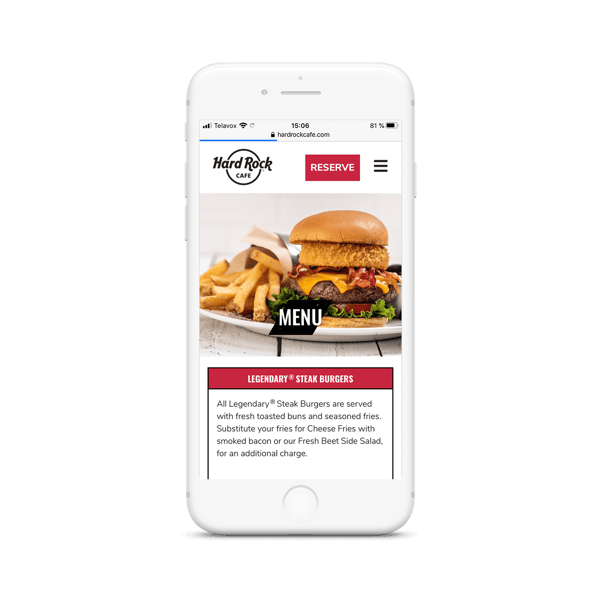
Our customer Hard Rock Café does this well, you can always access "reserve".
3. Remove menus in PDF format
Publishing your menu as a PDF is bad in so many ways. It is not user friendly and very old-fashioned. It is almost like having to download files of clothing when you shop online. Not okay in 2020! In many cases, the PDFs are rarely optimized for mobile and the readability on small screens is terrible. In addition, the PDF will take up the entire screen, or open in a new window, which means your button for book a table will not be visible.
Further, the text in a PDF will not be indexed by Google and therefore not appear in search results on Google. Imagine if a potential guest search for your restaurant’s name and a signature dish – and your restaurant does not appear in the results?
And it adds unnecessary friction for your guests who simply just want to read your menu. I advise you to remove the PDFs as soon as possible.
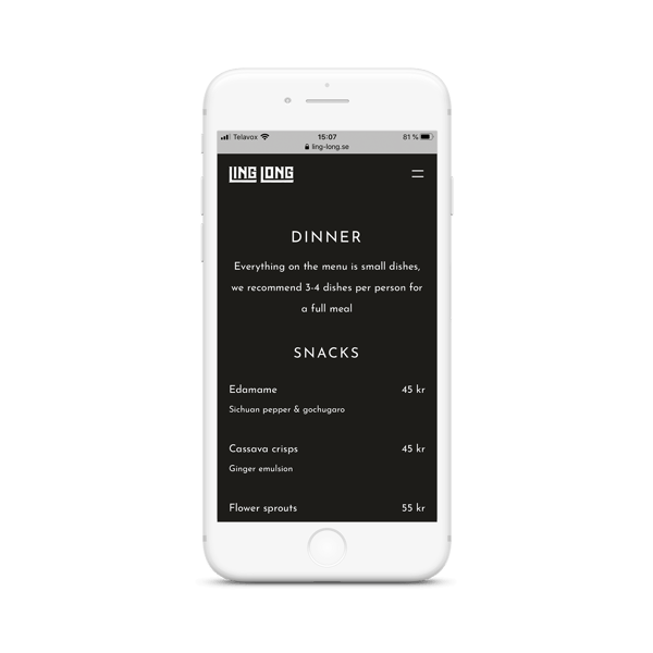
 Trivec Customer Ling Long provides website visitors with well designed and easy-to-read menus with clear prices.
4. Optimize your website for mobile
This is an absolute MUST today. Based on statistics derived from the Swedish market, one can draw the conclusion that most website traffic originates from smartphones. The smartphone is something we always carry with us, and uses to accomplish daily tasks.
Therefore, it is crucial that your website is optimized for mobile and a smaller screen. Lots of restaurant websites opens the menu in a new window which leads potential customers away from the main page. The customer would need to identify the right page window in order to complete a booking. This is not considered best practice.
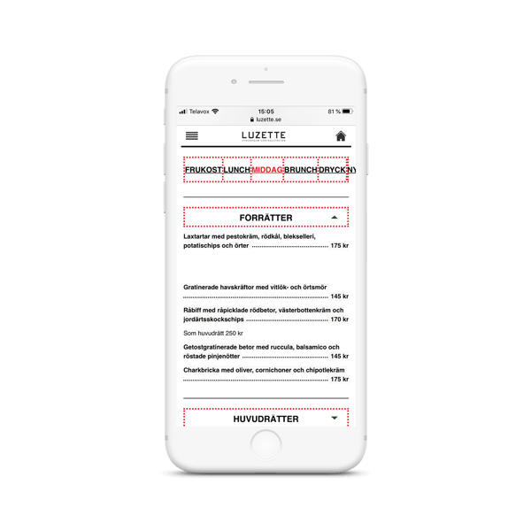
 Restaurant Luzette's effective design of menus as you can go from breakfast, lunch and dinner seamlessly. They take advantage of smart technology.
5. Maintenance and keeping your website up to date
Always, always, always(!) make sure the links on your website work. I came across a great many 404-pages when clicking on campaign-links when I was conducting research for this article. It is not professional to have broken links on your web page. I also came across a page that mentioned “we have a new website, click the link to…”, and a link to take me to the new website. What you should do is to redirect the old link so that your visitors go straight to the new page without encountering the old, empty page. This equals less friction and a better experience for the visitor. If you do not know how to to solve something, ask for help. In addition, Google will prioritize the websites that update the content on a regular basis, as well as quality and relevance of the content.
If you go ahead with some of my recommendations, I can promise you will notice a difference in online bookings and I would love to hear about how it worked out for you! In the next blog post, I will discuss setting goals for your social media accounts, the importance of analyzing data to optimize activities and the next steps for your website.
If you have any questions, feel free to contact me.

 Svenska
 Dansk
Dansk Norsk bokmål
 Français
 België – NL